In the last post titled, Statistics – Understanding the Levels of Measurement, we have seen what variables are, and how do we measure them based on the different levels of measurement. In this post, we will talk about some of the basic concepts that are important to get started with statistics and then dive deep into the concept of dispersion.
Histogram:
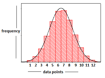
A histogram is a graphical representation of the distribution of numerical data. We know the basic bar graph, but in a histogram, all the bars involved are connected or they touch each other – meaning that there is no gap between the points. Eg: Consider we have some data points (i.e values of the variable that we measured), we create this histogram by plotting the data points against their corresponding frequency of occurrence in our random sample. We then draw the distribution curve by connecting the midpoints of the bars in the histogram. So the important point to remember here is that there are bars sitting below that curve, and the process of drawing the distribution curve is – numbers -> bars -> curve.
